
Scoops Creamery
Client Type:Fictional Business
Project Scope: This self initiated design challenge was completed in 3 days to explore how quickly and effectively I could build a cohesive brand identity for a fictional business. The project included logo design, typography selection, a custom brand pattern, t-shirt design, an Instagram post mockup, and a basic brand style guide (excluding a full website). The goal was to simulate a real-world branding package under time pressure.
Date:2025


logo
The Scoops Creamery logo uses soft pastel colors to create a playful and inviting feel that reflects the joy of ice cream. Rounded typography to emphasize the brand’s friendly and modern personality.
Tools used: Adobe Illustrator
Role: Concept sketching, layout, and final vectorization
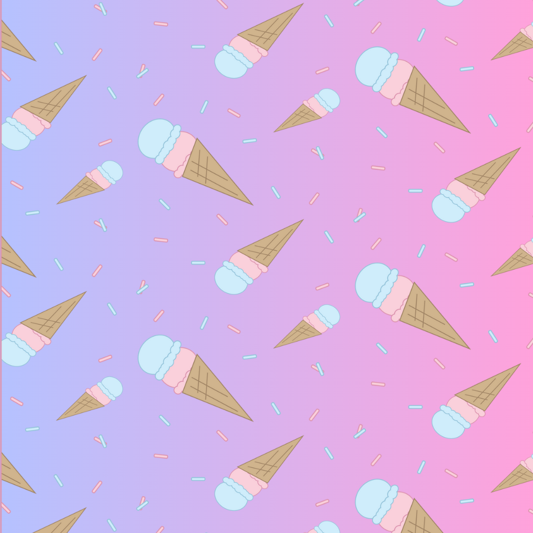
Pattern
The Scoop Creamery pattern features play full pastel shapes inspired by ice cream cones and sprinkles. Its soft color pallette and repeating design create a lighthearted, nostalgic feel that extends the brand’s identity beyond the logo.
tools used: Adobe Illustrator
Role: Concept sketching, layout, and final vectorization
T-shirt Design
The Scoops Creamery T-shirt design incorporates pastel colors and a secondary logo. It extends the brand’s friendly nostalgic personality into merchandise, making it memorable.
Tools used: Adobe Illustrator
Role: Concept sketching, layout, and final vectorization
Brand Style Guideline
This brand style guide showcases my ability to create a cohesive visual identity. It includes logo variations, typography, color palettes.
Tools used: Adobe Illustrator, Canva
Role: layout, and final vectorization


Social Media Post
The Scoops Creamery social media post brings together the brands’s key elements, showcasing the logo, T-shirt design, and playful pastel pattern in one cohesive layout.
Tools used: Canva, Adobe Illustrator
Role: layout, and final vectorization